WaterField iPhone Wallet & iPhone Hint Leather Cases for iPhone 4S Review
/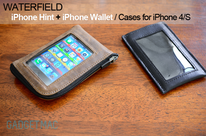
It may come to you as a surprise that your wallet can now also be your iPhone's protective case. It's a "kill two birds with one stone" kind of deal when you think about it. WaterField for years now has been one of our favorite case and bag makers with a rustic touch and great quality. iPhone case wallets are fast becoming trendy and now WaterField's first wallet case is unmistakably called the iPhone Wallet. A hand made leather wallet case with a touch-thru clear screen and a roomy interior. The iPhone Hint is another hand made leather wallet case geared towards those who carry only the bare minimal. We've been sent both to have a good look at so be sure to check out the full review right after the jump!

The iPhone Wallet and iPhone Hint have two thing sin common and that is letting you use your iPhone inside each without having to take it out. You can even go as far as making calls. Both of these cases are means to carry your lovely iPhone and your wallet essentials in one small package. We all carry around both of these items in our daily lives as is and the idea of the wallet case is the perfect solution for the "problem". And yes you can see that if you lose your wallet case, you end up losing both your wallet and your iPhone instead of reducing the risk of ending up losing either one. That's just something you need to take into consideration like anything else. But we're not here to lecture you so let's get right into business! First off we're going to start with the iPhone Wallet.
/The iPhone Wallet
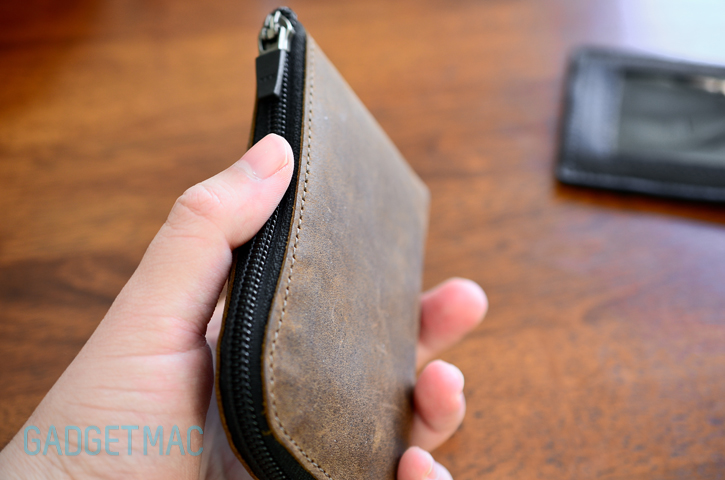
The iPhone Wallet will run you $39 and comes in a full leather exterior build that is found on the popular Muzetto bag. The leather comes in black or brown and is naturally tanned. The leather has a really nice feel to it, soft and supple. Not to mention it smells great like all good leather. WaterField knows how to put together a leather wallet let me tell you that. Stitching it top notch without a single loose thread. The zipper that keeps the iPhone Wallet securely closed feels like a heavy-duty zipper. In many ways the iPhone Wallet is a rendition of WaterField's Wallet only that is has a window for the iPhone.

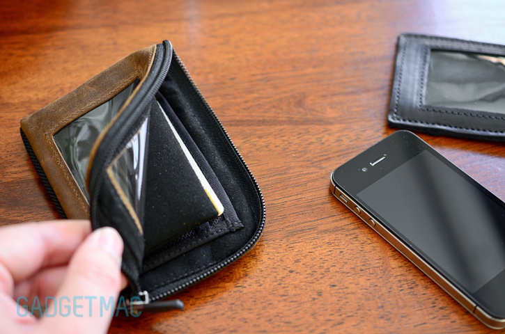
Taking a look at the inside of the iPhone Wallet we see the Ultrasuede fabric that lines both sides of the interior and when your slip in your iPhone into the front compartment, an Ultrasuede padded rigid divider keeps it isolated and separated from all of your cards. I was able to fit my iPhone 4S inside with a slim case on as there is plenty of spare room unless you stuff the wallet with a bunch of cash.

Right after the iPhone's cosy compartment is where the wallet side of things starts to happen. There are two card slots one being a larger one lined with Ultrasuede that you could fit roughly five different cards including a few business cards. The main compartment which is sandwiched between the card slots and where the iPhone sits is the place where you could store your cash. Unfortunately, I rarely carry cash with me as I'm a heavy card user as it's more convenient for me. It's safe to use that the iPhone Wallet will be able to store all that you carry in your typical wallet but with less card slots and instead of using that clear window for your ID, your iPhone takes the spot instead.
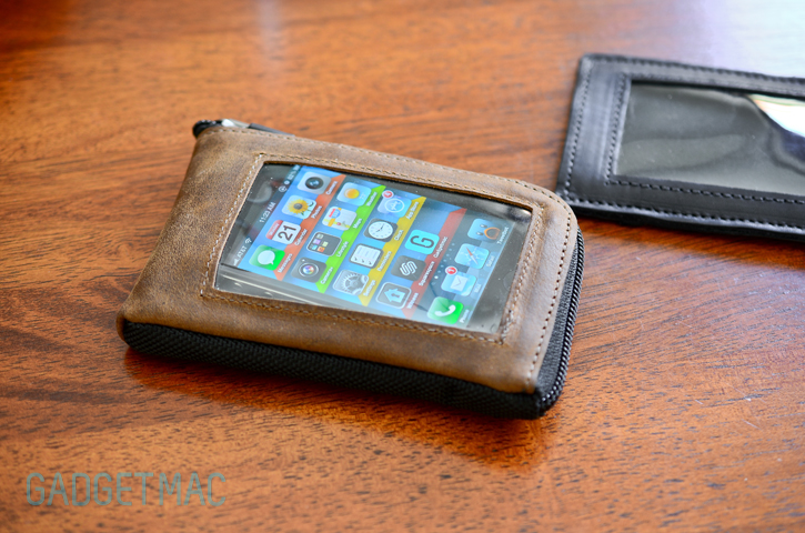
After spending a while using the iPhone Wallet, I did run into all of its downsides. Using the iPhone 4 and iPhone 4S without any case and a moderate amount of wallet stuffing, I did find that my iPhone would tend to slide around inside a bit. The iPhone Wallet has no custom cradle that snuggly keeps hold of the iPhone and keeping it from moving about. Like I said before, it looks like very little was done to transform WaterField's Wallet into a custom wallet case made to precisely fit the iPhone 4 and iPhone 4S.
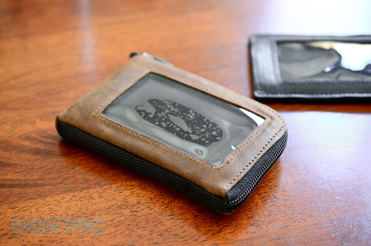

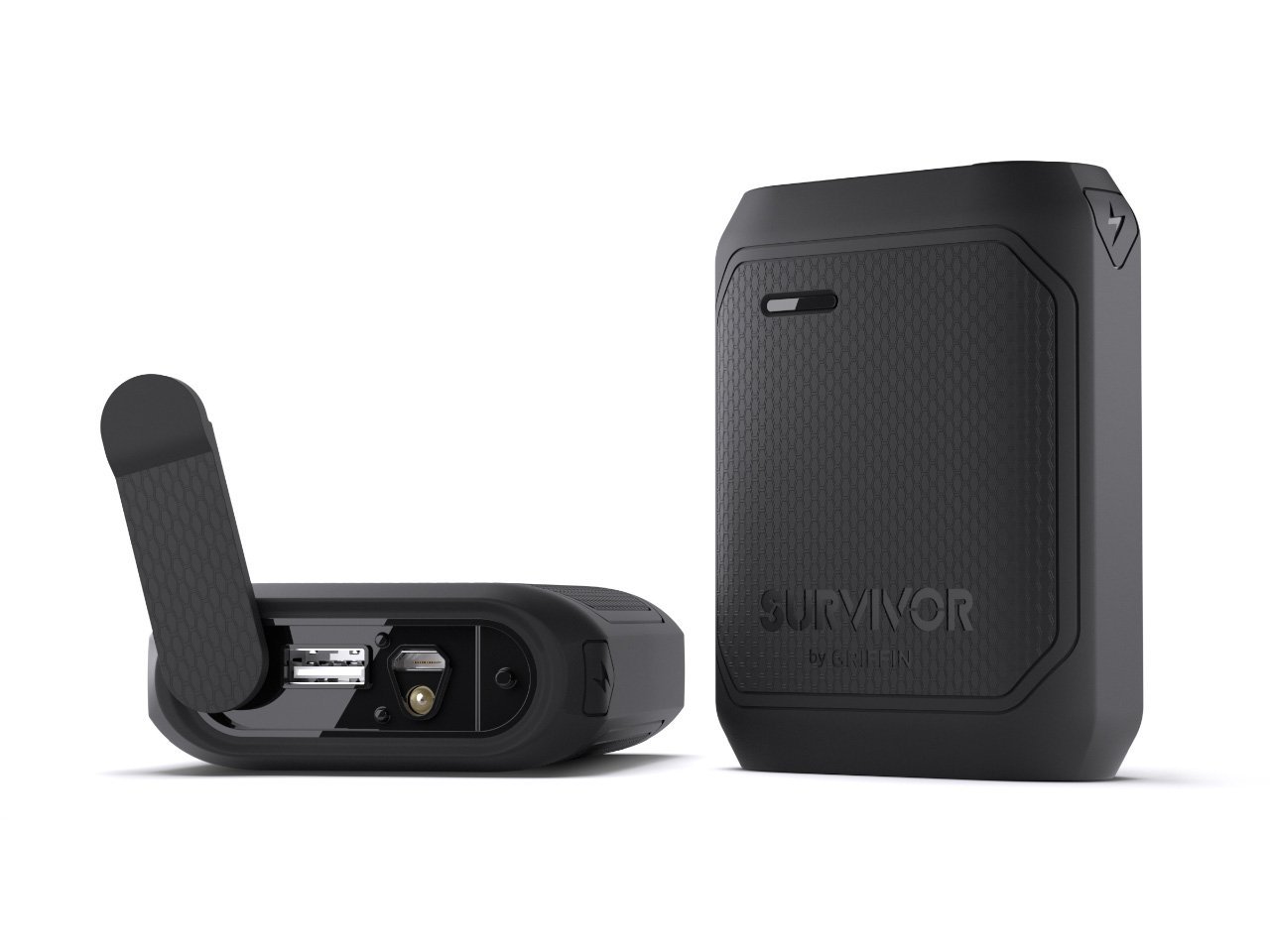
Getting to the more prominent aspect of the iPhone Wallet, the clear window. Although you can fully use your touchscreen thru the clear built-in window, there's a heavy amount of excess material that just floats on top of the iPhone's screen and makes it difficult to use and touch each part of the touchscreen. Unlike other built-in screen protects in cases like the Griffin Survivor, the iPhone Wallet simply uses the ordinary ID window which proves to be a bad idea for ease of use with a touchscreen device. With that being said, the iPhone Wallet is more of a wallet than it is an iPhone case. It feels like the touch-thru window was a quick afterthought than a primary feature but it still works as it should with a few big drawbacks including hard to press, partially covered home button and covered up proximity sensors. I haven't seen any attention to detail here and I'm unimpressed by WaterField for the first time ever.
Even though the iPhone Wallet has no cutouts whatsoever, sound still manages to pass thru. I wouldn't necessarily try to talk this way but you know that you can if you want.

/The iPhone Hint
And now onto a much cleaner looking case, the iPhone Hint. The iPhone Hint comes in really nice black and brown naturally tanned leather. In comparison, the iPhone Hint takes a more simplistic approach to a wallet case and has a slimmer form factor that looks more like a sleeve case which it really is. It also feels much stiffer than the iPhone Wallet when holding.
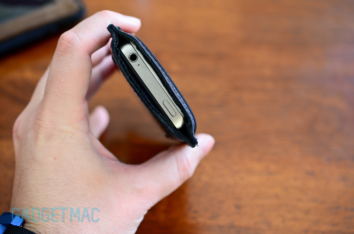
The top opening lets you easily slip your iPhone right into the iPhone Hint, and even though the opening remains opened, the iPhone won't slide out on its own. Unlike with the iPhone Wallet, you've got direct access to the headphone port and sleep/wake button at all times. The opening does have a bit of clearance that keeps the iPhone recessed inside. Other than a top opening, the iPhone hint has no other cutouts or opening. You won't be able to adjust your volume or take photos on the fly with this wallet sleeve.

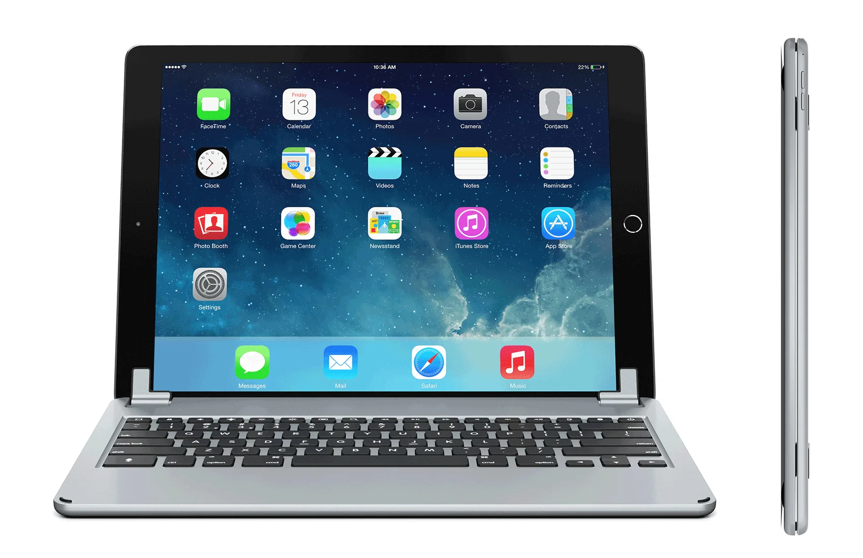
Around the back is where you can keep your cards and some cash stored inside the stretchy mesh pocket. I was able to fit up to five standard cards and less if I were to include some bills. It's worth noting that your cards will easily show thru that mesh pocket. The more cards the harder it is to take each one of them out. I found that using only one finger to slide each one out works best since there is no bottom cutout to help you push them up from within the pocket. Again, compared to other wallet cases available such as the BookBook, the iPhone Hint and iPhone Wallet have a lot to catching up to do.

Sadly, the iPhone Hint also took a big hit in the usability department. I've had really high expectations from both of WaterField's first wallet cases for the iPhone 4 and iPhone 4S, but unfortunately I'm disappointed to see that one of the most important features in both of these aren't cutting it. The iPhone Hint's touch-thru window also suffers from the horrible excess of material that makes me feel like I'm trying to use my iPhone that was thrown into a quarantine suit. Using the touchscreen is really hard. I feel like I'm constantly battling to press each point of the screen. I really don't think the iPhone Hint could pass it as a usable wallet case. The leather and stitching is all great, but what's the point of having to lose all smoothness and responsiveness of the iPhone's touchscreen? I really wanted to like the iPhone Hint, and even spending as much time with it to see if the leather adjusts to the form of the iPhone but to no avail.

While I think the iPhone Wallet is the better choice here having a more responsive touch-thru window screen, I expect WaterField to make the appropriate changed to make things better or in other words, work. Unless you want to turn your iPhone into a load of bad user experience while looking good at it, the iPhone Hint is in desperate need of a redesign. WaterField had a good thing going on with these duo of wallet cases, but our dreams of the perfect wallet case are still in full effect.
 iPhone Wallet
 iPhone Hint


