4th Design Blade 5 Aluminum iPhone 5 Bumper Review
/

Tiger Design, now called 4th Design, struck gold when it first released the Blade bumper for the iPhone 4. The Blade was a one-of-a-kind CNC machined metal bumper that felt and looked like a well oiled weapon more than the simple protective accessory it really was behind all the tough metal armor. And that's a case in point that Korean design can be unique. 4th Design's newly released Blade 5 is yet another aluminum bumper continuation of epic street cred proportions. It is a heat seeking missile homing in on iPhone 5 users and their deep pockets. We managed to get our hands on the Blade 5 before its official debut, and boy we so excited. So be sure to check out the full in-depth review down below to see how it stacks up against the Japanese Draco 5 rival.
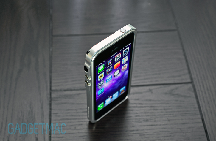
The Blade 5 is a CNC machined aluminum bumper with an improved design that is said to substantially increase reception performance. If you haven't heard about the original Blade bumper, its all-aluminum construction did impede on reception considerably. But this time, we are pleased that 4th Design did improve the signal reception with the Blade 5. Going straight into the reception results first - with the Blade 5 on, I've noticed a drop in a full solid bar on reception. And if we take a closer look at the raw precise numbers behind the bar graphics using Field Test, the results show -87dB without the Blade 5 on and -96dB with the Blade 5 on. So while these results aren't as great as what 4th Design claims, we don't think they're bad at all given the fact that the Blade 5 is full of aluminum goodness. Let's not forget that results will always vary when using aluminum-type cases.
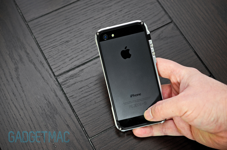

4th Design's Blade 5 is a lot of what the original Blade was. In essence it has retained the same concept we really liked about the original design. At first blush, the backside of the Blade 5 features the new plastic polymer made frame that is replacing the original aluminum made frame which is used to secure the iPhone 5 inside the bumper using 4 ordinary phillips type screw heads. Nitpicking aside, although we did call out these normal looking screws back when we reviewed the Blade, it doesn't seem to be all that important now.
At the moment, you'll soon be able to grab the Blade 5 in 7 different anodized colors like the raw silver and anodized red flavors we have here for $79 at an authorised 4th Design reseller such as Tekcases.
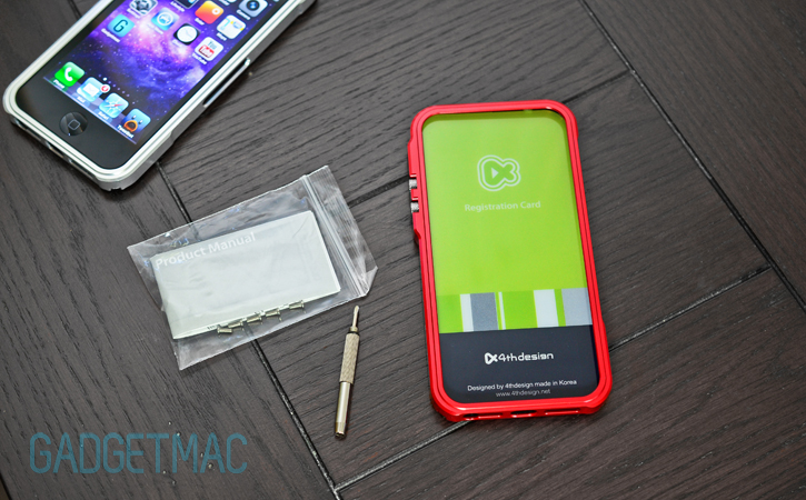
A quick rundown of what's inside the packaging: the Blade 5 comes with a handy dandy metal multi-tool of a thing that will easily help you screw on those 4 phillips screws, some unneeded instructions and a very generous slew of extra screws in case you lose a few down the road. Thanks 4th Design for looking out!

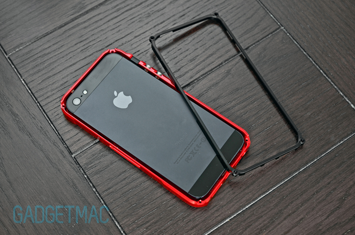
Installation is remarkably dead simple and easy with no metal buttons to fall out. Everything is built-in already and in position, awaiting your installation. Well except for the plastic silent switch. The new plastic polymer frame secures onto the back of the Blade 5 using four screws exactly like the previous Blade bumper. Because of how the plastic frame is designed as a half-cut bumper insert, it actually protects the iPhone 5's sides, top and bottom portions without having the need of foam pads interiorly.
There is no metal-to-metal contact except for the front portion which needless to say is quite an oxymoron. That and the fact that there is no padding or lining to on top of the built-in metal buttons which could scuff your iPhone 5's buttons if you don't put some scotch tape yourself.
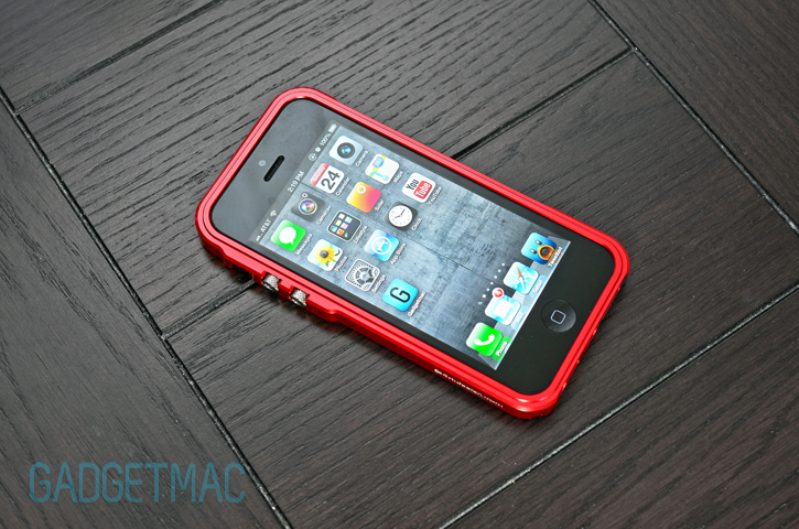
The iPhone 5 fits snuggly inside the Blade 5 as expected with no wiggle room whatsoever.
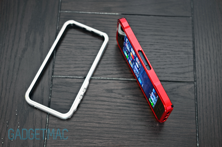
Here we go again. A large, unnecessary SIM card cutout along the right side of the Blade 5. Why oh why. Speaking of cutouts, the Blade 5's bottom series of port cutouts are all easily accessible.
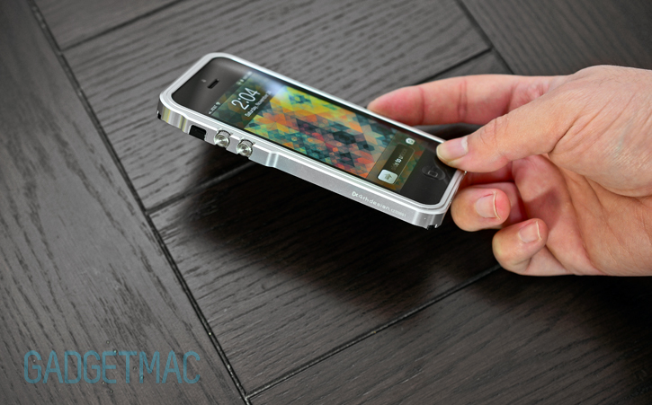
I was really looking forward to using the Blade 5 as I was a fan of the original long ago. The Blade 5 is unfortunately bulkier and less streamlined than the original Blade bumper. While the Blade 5 is a slim aluminum bumper, it is wider. Blade fans will either be happy about the new design, or as disappointed as we are. The Blade 5 isn't a very good looking aluminum bumper. Take the E13ctron S5 and slap it with a fancy set of volume buttons building out the left side and you've got a Blade S5 with a proper working installation method and enjoyable to use tactile buttons. I know I said the Draco 5 was a backwards step compared to the Draco IV, but with all of those sexy aerodynamic curves it's looking much better than the Blade 5 that's for sure. Now it's obvious that design is a matter of personal taste and opinion, but don't think that the style is all of the Blade 5's problems.
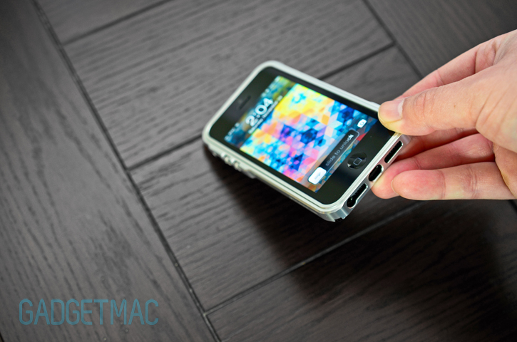
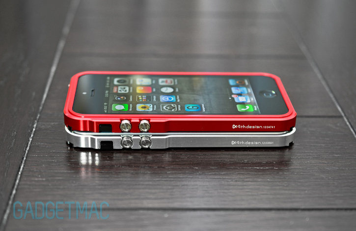
When you look for an aluminum bumper, the design is everything. Because they never are as comfortable to use as a traditional plastic bumper or case. The original Tiger Design Blade was the dubstep of its generation. 4th Design's Blade 5 on the other hand is trying to overcompensate. That bulging side where the diamond-cut knurled metal volume buttons reside is the apparently new main attraction feature. If the detailing of built-in metal push buttons weren't enough, the added protection surround them is plain overkill and completely unnecessary. It's too bulky, too unwieldy. Why the bulky button arrangement? The original Blade has a perfect set of built-in buttons that were inconspicuous yet highly functional.
When you get a notification and your iPhone vibrate on a table, the built-in metal buttons shake around like a rattling rattle snake. They generally rattle regardless, and that can be annoying. A simple fix would be to put some scotch tape on the interior.
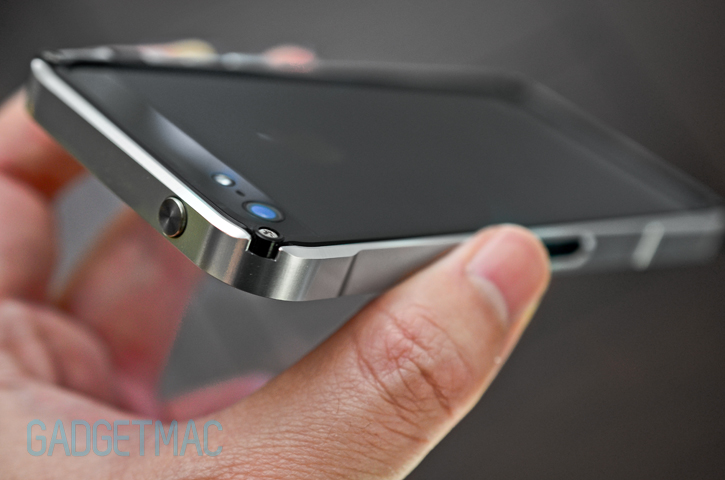
Screw head housings aren't flush with the corners so they protrude out a bit and you definitely feel that in the palm of your hand. 4th Design learned nothing from past criticism on the original Blade, yet claim it has this time around.
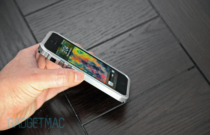
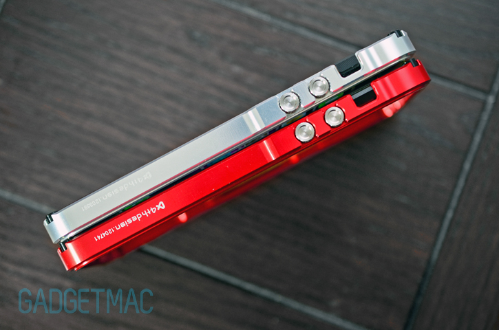
That special Transformers-like machining finish with the micro-serration tactile feel all around the aluminum isn't anywhere to be found. The Blade 5 sports a slick, polished finish that quite frankly isn't as impressive as the original Blade bumper, and that's a shame. With that said, the color and polished finish is of very high quality.
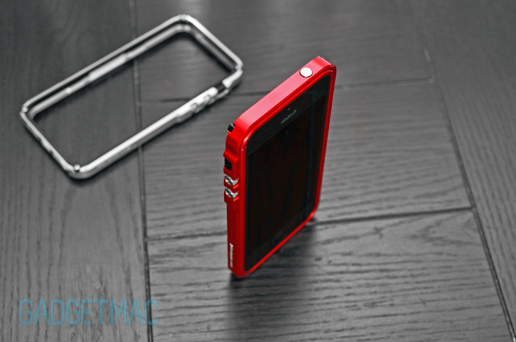
That front double-edge rim design is simply overly clunky to look at. And when all you do is stare at the front of your iPhone the majority of the time, you really get put off by how dull looking the Blade 5's front end is designed. Or should I say unfinished by the CNC machining robot. However, if you do look at it from behind or from a side prospective then the Blade 5 does have its fair share of good looks. Arguably.
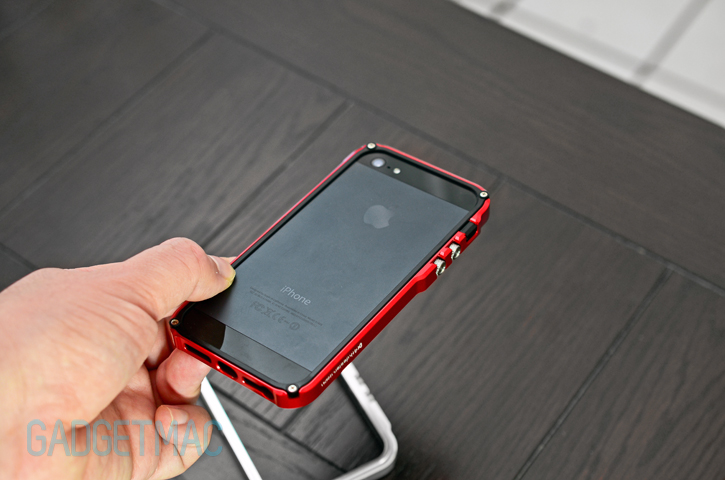
The lack of color options for the Blade 5's back plastic frame is also a disappointment. The original Blade allowed users to grab a combination of colors that suited their personal unique tastes, and now all you'll be left with is a choice of black, black and some more black. But then again, 4th Design can certainly add more color selection before you know it. They say black goes with everything, and that's most definitely true in this case. The black frame on top of the red or silver aluminum does make for a very interesting piece. 4th Design is trying to keep things more conservative for now.

There's a very odd trending tendency for case manufactures to take great working designs and instead of improving them, they make things worse. The Blade 5 is a case in point, but it's not necessarily a bad aluminum bumper. In fact, it actually serves its bumper-style aesthetics in making the iPhone 5's backside really interesting to look at. 4th Design's Blade 5 sadly has a bunch of small negative that come with it, but in reality it does perform very well. So while the new design and quirky features don't sit with us very well, you might end up liking what you see.
