iOS 7 Officially Announced, Coming This Fall

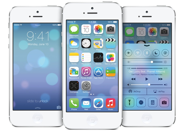
After Apple revealed OS X Mavericks today at WWDC, the company went on to announce a totally redesigned and highly anticipated iOS 7. Compatible with the iPhone 4, 4S and 5 including the iPod touch 5 and iPad 2, 3, 4 and mini - iOS 7 is as majestic as we've imagined it to be and it'll be ready for us all this fall. Simplified to the utmost extreme, iOS 7 features a completely new and much simplified lock screen which features direct access to a new feature called Control Center by swiping up from the bottom at any given moment and place. The same can be done to bring up Notification Center by pulling down from the top. The user interface has been revamped with smooth transition animation and sleek typography that'll satisfy just about every existing iOS user and Apple fanperson.

Read More

OS X Mavericks, The New Mac Operating System

Apple admitted it had trouble naming the next generation of OS X, but it picked a name devoid of cats so that it'll continue on for years to come. OS X Mavericks 10.9 is what it's called, Apple's impressive next-generation Mac operating system slated for a fall release. Little has been done done in terms of user interface design, however, a lot has been focused on improvements and more than 200 new features that some more notably intelligently help prolong battery life thru smart power consumption and power-saving technologies like App Nap that run seamlessly behind the scenes as you work to reduce CPU load by slowing down apps that are hidden in the background when you are focusing on something else.

Among a sea of new features and enhancements which some include power users in mind, OS X Mavericks supports up to 4K display resolution and a featured called Multiple Displays allows the system to operate individually across multiple external displays whilst retaining menu bars and docks on each screen instead of relying on one primary display interface to handle different tasks. It also has deeper iOS app integration than Lion has with apps such as iBooks and Maps now available on a desktop level. Your iOS apps will sync with your OS X apps, and Finder has been enhanced with organization tabs and tagging for quicker more specific search results.

Apple got rid of Scott Forstall's old school design choices which included wood, leather and felt elements in app interfaces. The newly designed Calendar app for example is now more simplistic look to coincide with the rest of the stock apps. There's a lot more to discover, and you can learn more about OS X Mavericks on Apple's detailed OS X Mavericks overview page

Nir Schneider

Editor-in-Chief

New iOS 7, OS X Banners Revealed At WWDC 2013

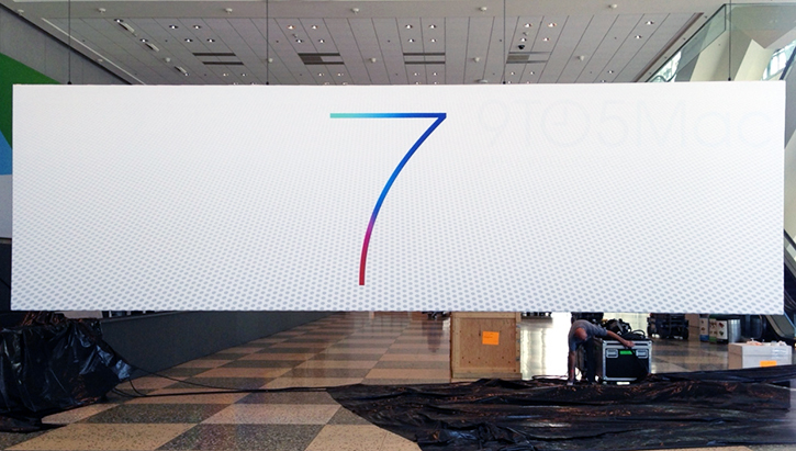
With just 3 days to go before WWDC 2013 begins where Apple will unveil its latest iOS and OS X operating systems, purportedly along with a few new hardware announcements, banners of Apple's iOS 7 were hung up at the Mascone center in San Francisco where this year's WWDC event will be taking place. One of the main banners shows a colorful, thin and minimalist "7" (the new iOS 7 logo we presume) with a very subtle gradient background grid supposedly denoting a complete design overhaul of iOS - which is what we're all expecting it to be.

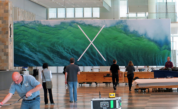
In addition, it looks like OS X will be receiving a more modern and minimalist facelift judging by the new OS X "X" logo plastered on one of the many welcoming, but mostly teasing banners at the Mascone center. There's no doubt Apple wants to convey a refreshing change. The two banners feature an identical sleek font that Apple has never used before indicative of a more uniformed design language being implementing across the two platforms. From what we can tell, this is a huge design change that leaves behind the glossy reflections and heavy bold design that has been present in Apple's repertoire over the years. Here's what last year's WWDC banners of iOS 6 looked like. So far we like what we see, sir Jony Ive.

Nir Schneider

Editor-in-Chief

Why You Shouldn't Purchase The New 16GB iPod Touch

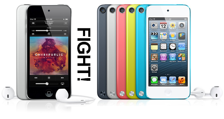
In case you haven't heard, Apple released a 16GB iPod touch without a rear-facing 5-megapixel iSight camera at a more affordable $229 price point. The thing is, as a consumption device the new 16GB iPod touch will quickly fill up with hefty games, music and movies. For an additional $20, you can get a refurbished 5th generation iPod touch with 32GB of storage and a 5-megapixel rear-facing camera capable of recording 1080p videos with even more colors to pick from for $249. Apple's refurbished iPods are practically new and come with a one year warranty, but you can only purchase them online. The new 16GB iPod touch isn't worth purchasing with such a small difference in price compared to a like-new 32GB model offered by Apple itself. 

Nir Schneider

Editor-in-Chief

Apple Releases New Cheaper iPod Touch 5 With 16GB Of Storage


Today, Apple has introduced a cheaper iPod touch 5 with a 16GB storage capacity for only $229. The new model is available now, and still has the same 4-inch Retina Display, ultra-slim aluminum build, a dual-core A5 chip and all the usuals as the more expensive 32GB and 64GB models; even a set of EarPods. The catch? It lacks a rear-facing camera (you've got an iPhone for that no?), the loop strap and it only comes in one color, silver. Still, great news for minimalists all around. In a move towards offering more affordable products that will enable more people to enjoy the fruits of Apple, it is rumored that the company will eventually release a more affordable iPhone model as well. This is a great start so far.

Nir Schneider

Editor-in-Chief

iOS 7: What It Might Look Like

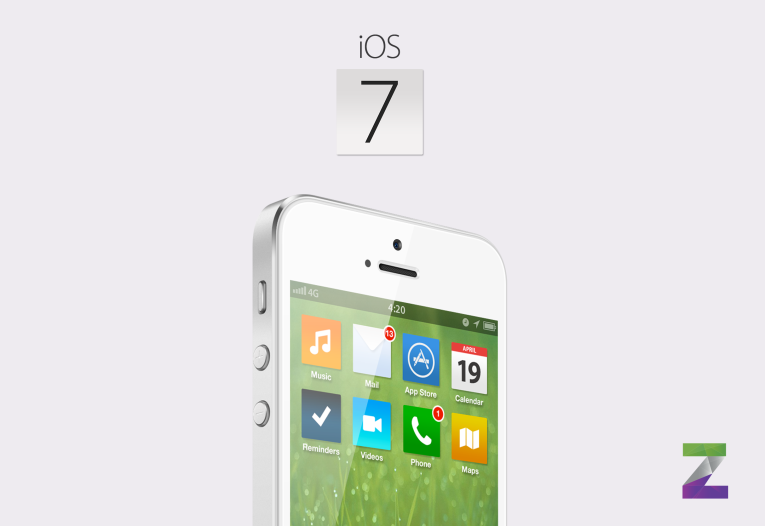
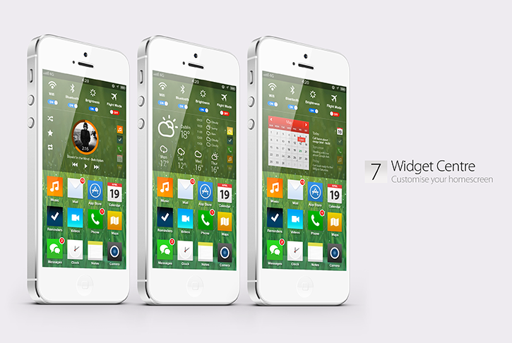
Do you smell that? It's the smell of a new iOS brewing. Now that Jony Ive is in charged of redesigning iPhone's OS interface, rumors spread that Apple's upcoming iOS 7 will feature Ive's brilliance in design and of a revamped 'very flat' user interface free of gloss and those iconic rounded corners. All we have now are concepts of what we expect out of this flat new design, and this particular iOS 7 concept made by Simply Zesty is breathtakingly beautiful. Slick app animation, a clean fresh look with an informative lock screen and Notification Center, Android-inspired widgets and a clean interface partly borrowed from Windows Phone 8. It's all there, and it feels right.

This vision for what iOS 7 could be like we think is stunning enough to land its designer a dream job at Apple HQ. We've seen it happen in the past. Let's say no more to leather and wood trim, here's to a truly up-to-date iOS! Head past the break to see this iOS 7 concept in action.

Read More

What If HTC's One Was Actually Apple's iPhone 6

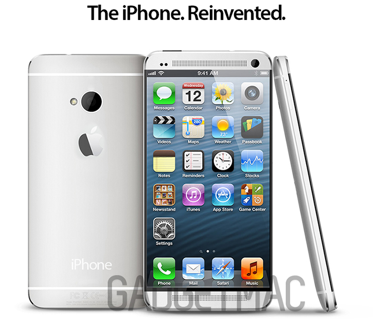
HTC's One is undisputedly the best looking Android handset of the year, arguably borrowing a lot from Apple's unique design language and iconic build quality etiquette. Any iPhone user wouldn't be ashamed in admitting he or she would love to own one if only it were running iOS instead of Android. And that got us thinking, what would it be like if the HTC One was actually Apple's next generation iPhone? It would have been a marvelous 4.7-inch device running a totally revamped iOS 7, a truly reimagined iPhone built from the ground up with refreshing new features, and less of an iPhone circa 2007 influence to restrict innovation from moving forward.

In other words, we iOS users hope that Apple would take note of HTC's brilliant design and that includes simple things like a front-facing speaker, because there's an awful lot of tempting competition quickly rising which will turn many bored consumers over to the Green Side, or at least for a little while.

Now that HTC stepped up its game, we bet Apple is feeling the pressure from its customers and rivals like Samsung and HTC. The expectations for the iPhone 6 are extremely high. But until then, there is no doubt that we will see an iPhone 5S before any sort of breakthrough iPhone steps into fruition.

Nir Schneider

Editor-in-Chief