Mutewatch Multi-Touch Watch Review
/

The Mutewatch is undeniably one of the most amazing watches a geek can ever wish for. It's quite literally the evolution of time keeping. The Swedish company behind the Mutewatch has created a watch that is so innovative and intricate on features yet has an inconspicuous design that is ahead of its time. The Mutewatch is a touch sensitive digital watch with an LED display that seamlessly blends good design with smartphone-inspired functionality. We go wrist on in our full, comprehensive review after the jump! You're not going to won't to miss it.
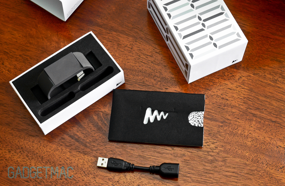
First thing first, the packaging and the included contents. The Mutewatch comes inside a really nice and well padded, iPhone-esque type box with some easy to follow graphic instructional manual and a short USB extender. The Mutewatch is available in red and gray colors only, we obviously have the gray one here to review thanks to our good friends over at Tic Watches. As for pricing, the Mutewatch isn't your affordable digital watch retailing at $259 and around $215 over at Tic Watches as of this review. But then again this isn't your typical Casio.

The first thing that comes to mind when you look at the Mutewatch is its utterly unique, unconventional design. It has a true Scandinavian design style that we've come to expect from companies such as Aiaiai and Jays, that's incredibly simple, clean and very much modern. The Mutewatch is different in every sense of the word from a run-of-the-mill watch in that it looks like a futuristic wrist gear you'd typically only see in Sci-Fi movies. The Mutewatch has a beautiful minimalistic one-piece, flowing design that's made out of TPU rubber and has a rectangle body as oppose to the round shape of just about every watch out there that makes it stand out from all the rest.
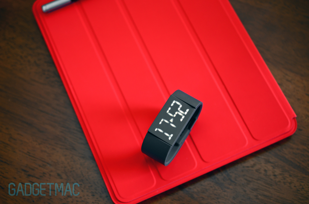

The Mutwatch is very much a fully functional watch that we see people use in their day to day lifestyle. So what makes it different? If the muted aesthetics didn't convey enough awesomeness, tapping, touching and flicking your wrist activates an otherwise seamlessly hidden LED display underneath the rubbery flat monolithic surface. The Mutewatch isn't the first and only gadget to feature such a concept, notably Nike's fitness wristband, the FueldBand implements a similar feature, albeit only activates thru the use of an actual button. And yes, the Mutewatch is water-resistant and the rubber construction is durable to an extent and cleans off easily.
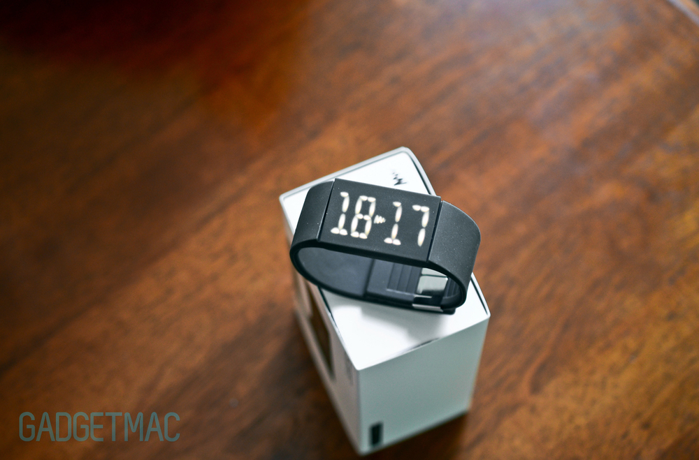
The Mutewatch's takes the crown with its intuitive motion detection thru the use of a built-in accelerometer to display the time to you when you flick your wrist slightly. I'm impressed of just how great the motion sensitivity works in activating the hidden LED display which in turn helps to conserve battery life. Speaking of battery life, the Mutewatch is rated to last a five days with normal daily use. In our testing, it has performed quite well and achieving a 4 day battery life on a single charge with daily, continuous usage with daily morning vibrating alarms.
We weren't kidding when we said the Mutewatch mimics today's smartphones. It's loaded with tech, including a light sensor hidden underneath the rubber surface of course. When the Mutewatch senses that it's under bright light, sunlight, it brightness up the LED display automatically and dims it likewise when it senses low light conditions in order to conserve battery power. But it also means that when your eyes are adjusted to darkness, the display won't blind you or disturb others in the slightest when it turns on. And all this light sensing works very well, but unfortunately the LED display isn't bright enough in order to properly read the time when in direct sunlight outdoors. We also noticed the LED color slightly turns yellowish from white when using the Mutewatch outdoors, most likely to help with readability.
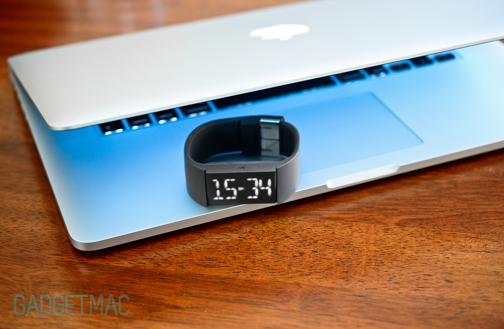
Let's focus a bit more on the display, because after all that's the Pièce de résistance. The Mutewatch is designed to display the capacitive touch screen display when you touch the flat surface displaying the time. When turned on and fully glowing in white LED glory, the time is displayed to you vertically on your wrist by design. And that can become a little weird to get used to coming from a regular watch that displays the time horizontally instead when you put your wrist in front of you. Because the Mutewatch's LED display can be seen easily from virtually any angle, it isn't such an issue. The numerals are appropriately digital in their style and are extremely easy to read thanks to their very large footprint that takes almost the entire watch face. Also, the touch surface is angled towards you at a fixed position despite appearing as if it were adjustable.
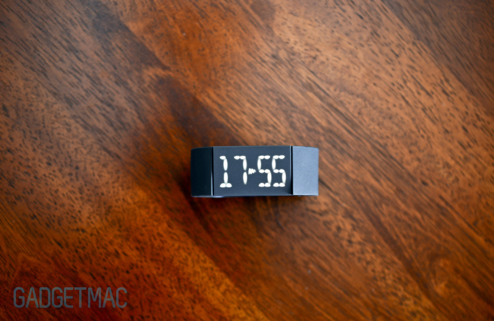
One thing to note is that the LED display isn't evenly lit causing the numerals to have an unsharp look despite the somewhat misleading official product photos of the Mutewatch. So that's something to bare in mind. Although we don't think it's such a big deal, especially when the light has to shine thru a rubber layer instead of having precise cutouts of some sort. We think it's still a nitpick worth baring though.
Listen up son! Another caveat that'll be kind of a big deal to some is the fact that the Mutewatch only displays military time and there's no standard setting to chose from sadly. We're really hoping Mutewatch pushes an update with some more features and settings added.
Interacting with the rubbery display is surprisingly very smooth, and an enjoyable experience once you get to know your way around the otherwise basic modes and gestures. It becomes pretty fun to swipe and tap your way thru the different settings, and even more so when utilising the motion sensitivity side of things. If you're not new to the world of touchscreened gadgetry, then the Mutewatch will be second nature to you. Otherwise, sit down a go thru the included infographic.
The display is a capacitive touchscreen display which from our testing worked pretty well given the fact that you're actually interacting with a rubber touchscreen instead of what we're all used to, glass. but it also supports Multi-Touch gestures meaning that you can pinch inwards with two fingers simultaneously in order to perform a task, in the Mutwatch's case that translates into deleting or resetting a set alarm or timer setting.
While the display on the Mutewatch isn't one of the most responsive and sensitive of touchscreens, it's plenty intuitive considering that fact that you're rubbing a smooth rubber surface. We think it has more to do with firmware in need of updating though. Which the company has yet to release for the first time.
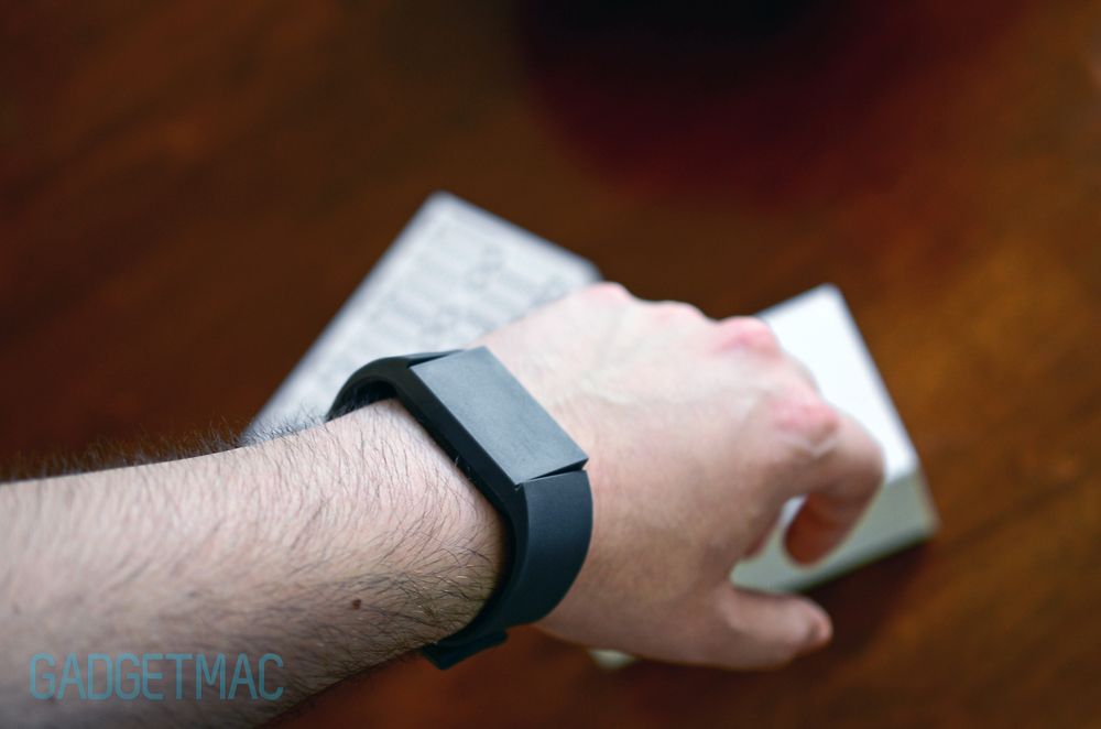

To change and set up an alarm or the time itself, you simply use swipe, pinch and tap gestures. That's all very fascinating to anyone who loves their tech, to put it calmly without actually calling it freaking awesome. Setting the time, alarm or timer is simple and quick. Tapping the bottom or top of each digit will move you towards your set goal. Once you have your time set, within a few seconds the Mutewatch will set itself accordingly and will notify you with a short vibration. Remember, the name of the game is silence, so there are no annoying and audible beeping noises.
The Mutewatch features a vibration alarm clock that will vibrate depending on your preference without making a noise and alarming others. Brilliant isn't it? It'll wake up calmly without alarming anyone near you, and depending on whether you feel comfortable sleeping with a watch on or not, it's actually quite a useful feature. When setting an alarm, a Mutewatch logo will appear in between the time that's displayed. Three boxes appear when the alarm goes off requiring you to tap each one in order to shut the alarm off.

The Mutewatch wears extremely nice on the wrist, and thanks to its unisex design, it looks good on a women just as well as it looks on a guy wearing it. To others it looks like a sort of stylish wrist watch or just a clean and simple rubber bracelet of some kind, and it isn't until you flick your wrist or tap the display that the watch comes to life and starts to wow those around you.
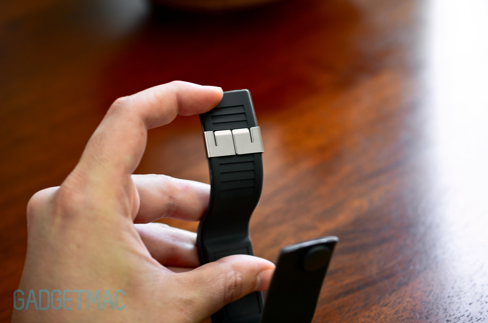

It feels really, and I mean really comfortable to wear. The Mutewatch is a "one size fits all" kind of watch in that it has a metal adjustable clasp which unfortunately won't fit you if you've got big wrists. Adjusting is easy and the band securely snaps shut using one button closure at the end of the band. What isn't so appealing about the Mutewatch and its button snap closure is how it was designed as if it were some one-time use concert bracelet.
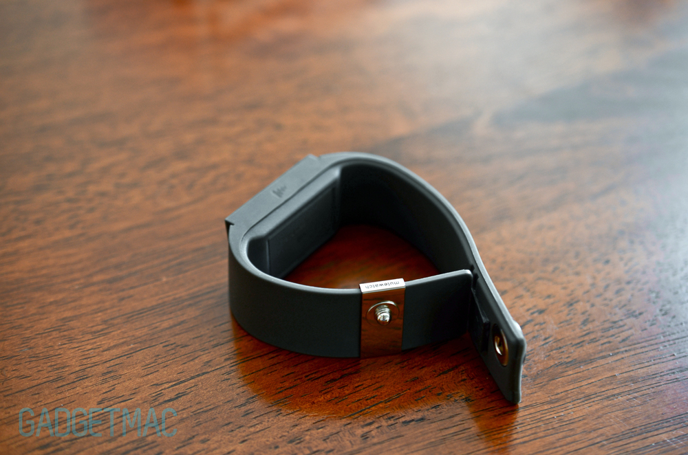
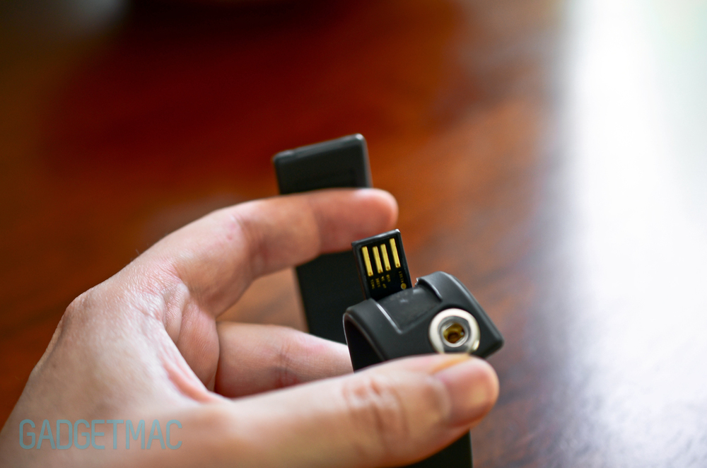
Around the inside of the band is where you'll find a super slim, one deck USB plug that's inconspicuously hidden into the band itself in a way that it doesn't interfere with your wrist while wearing it but can flex outwards when time comes to recharge the Mutewatch. You can use the supplied USB extended for an easier connection that isn't going to get in the way of other USB ports, or directly plug the Mutewatch to any USB power source. The Mutewatch logo will start to blink letting you know that it's charging. Charging is pretty quick and takes just two hours to complete giving you around five days of use.
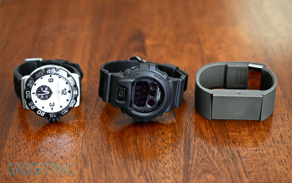
Anyone remotely familiar with digital watches knows that some of the digital clock-faces on the most popular watches like G-Shock are hard to read because of how small the clock interface is actually displayed on the watch. The Mutewatch by comparison is just an enjoyable watch to use.
The Mutewatch is the evolution and the future direction we're headed as far as digital watches go. The Mutewatch is without a doubt one of the most amazing pieces of tech you can put on your wrist. We love it, we love using it, and we want to see it evolve even further. Mutewatch really stands out in the timepiece realm, but it needs further tweaking and polishing to be called perfect.


