Fitbit Flex Review
/
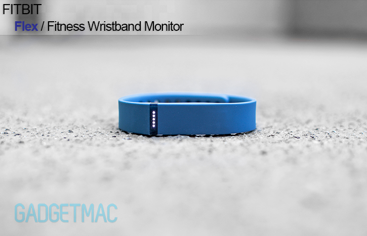
Fitbit is a long-time and sought-after player in the world of tiny, inconspicuous fitness tracking gadgets that help people who want to stay fit and healthy keep track of their daily progress and achievements met by setting certain goals. Up until now, Fitbit was known for its clothing clip-on monitors, but with companies like Jawbone around innovating the way we were these fitness monitors, it isn't a secrete Fitbit wanted a piece of Jawbone's Up pie which in a way managed to steal Fitbit's thunder for a while. Fitbit's new Flex is a iOS and Android-compatible wireless fitness wristband tracker, an Up rival with a favorable interchangeable design. This is a first for Fitbit, so naturally we thought it would only be fair to put it up against the Up in a dog fight. Should you grab a Flex, an Up or Fitbit's One clip-on tracker? We answer it all in our in-depth review down below!
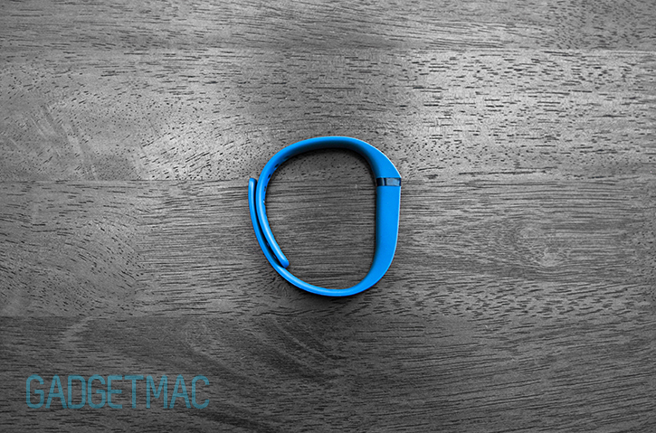
Fitbit knew it had to come up with something enticing enough to grab peoples attention with the Flex. The outcome? Personalization, kind of. The Flex lets you swap between different colored wristbands, which are known as accessories. You can purchase a wristband accessory pack that consists of three different colored Flex bands for $30, or pick an individual wristband out of the 5 available colors for $15. That's about where the differentiating aspect that sets the Flex apart from others of its kind through unique features, ends.
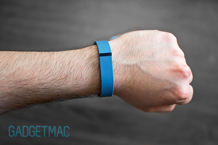

As for what other tricks it has up its wristband, the Flex does pretty much what is expected of it. Now considered to be basic features every simple pedometer has but with a few added "smart features": the Flex will keep track of your steps, distance traveled, the amount of calories you've left behind in your wake and but of course, the infamous sleep activity monitoring which isn't at all creepy mind you. It's also fully rain and sweat-proof as well as being water-resistant so you can hit the gym furiously with it, shower with it, bath with it and even swim with it. But you can't go deep sea diving with it.
The Flex's water-resistancy is rated for depths of up to 10 meters. Fitbit's sophisticated One tracker however, cannot be submerged under water. It also means the silicone rubber outer layer is durable enough and can protect the precious hardware that is inside of it which we will get into very soon. So far it has held up very well with no visible marks to be found on the wristband itself and that's impressive.
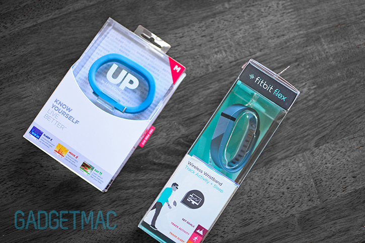
The Flex itself will set you back $100, and it includes the Flex tracker and two sizes of wristbands in the packaging, small and large - which is a great perk that simplifies the purchasing headaches compared to the multiple sizes the Jawbone Up is available in.

Further more, the Flex is based off of a traditional watch-like wrist band that allows you to specify accurately the right length that best fits your liking through the use of multiple holes and a secure clasp system. Nice packaging job too, Fitbit. Looks a little familiar but oh well.
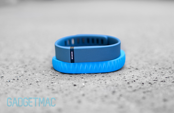

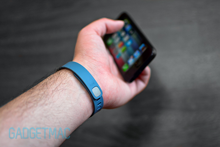
Fitbit's Flex is thinner, lighter, most comfortable out of all the fitness wristband monitors
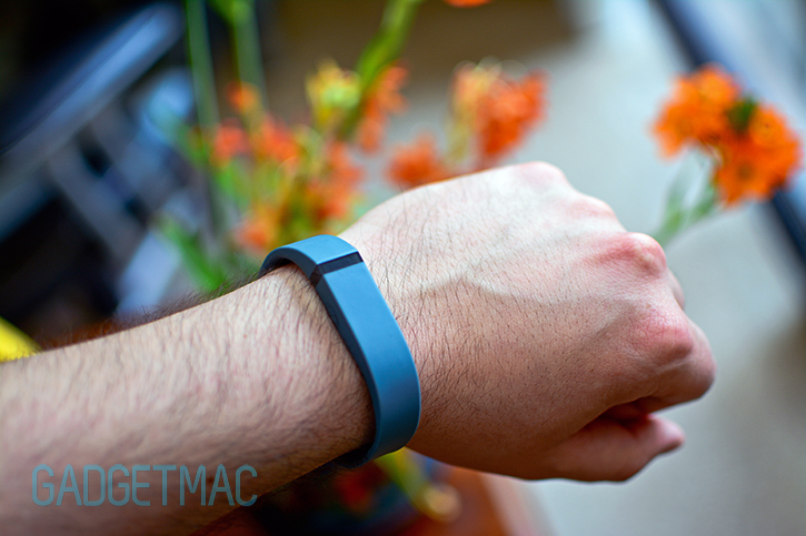
Fitbit created one highly trendy wristband with the Flex, but it lacks functionality. All of that empty space could have been utilized with great potential. The Mutewatch comes to mind when looking at the Flex's smooth flat rubbery surface which is almost monolithic-like, and I admire it now even more prior to strapping the Flex on my wrist for the very first time. Putting the Flex up against Jawbone's Up, the difference in styling is as unequivocal as black and white. The Flex isn't as gaudy nor is its build quality as fancy as the Up's jewelry-like styling which has been designed by a well known designer to be more than just a fitness tracking gadget but also a bold fashionable accessory. And if I'm honest, I much prefer the mundane yet modern design of the Flex to the Up's flamboyant fancyness.
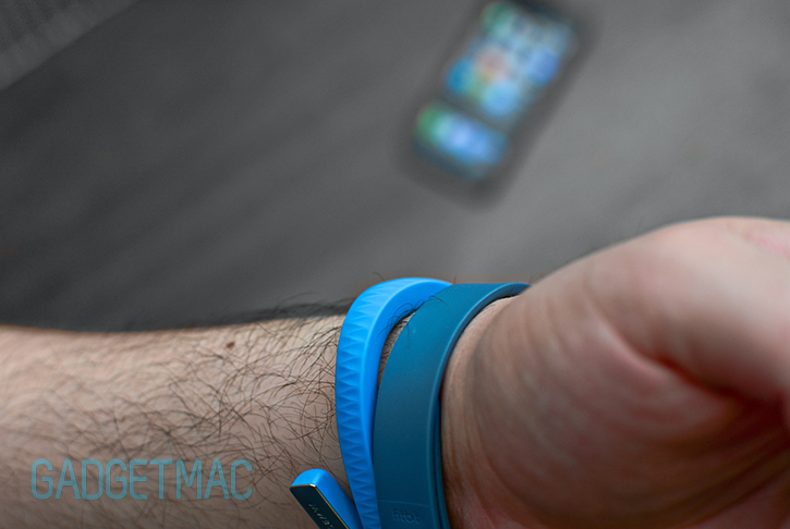
The Flex does a much better job at blending in against your wrist, and unlike the Up's wide design, the Flex's wristband is smooth and flat so that it doesn't get as much as the Up does.
![]()
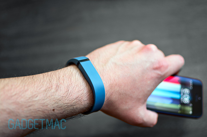
When Fitbit says you can wear this thing all day long without having to take it off except for when you need to fill the tank up, the Flex is hands down the most comfortable of all fitness tracking monitors. It's noticeably lighter and less bulky than Jawbone's Up and Nike's FuelBand. Having worn the Flex for a week now, I haven't felt any discomfort or hair-pulling whatsoever. The silicone rubber is ultra smooth, soft and just feels amazing against the skin. I'm in love with the thin wristband design. It's a significant improvement over the thick, albeit narrower, wrap-around form factor of the Up band.
If you thought wearing the Flex during sleep wouldn't be as comfortable, well then you're right. However, it'll really come down to personal preference. Some people like to sleep naked, I mean it's tough to say. I will note though that the rubber material might cause more friction than you'd expect which you'll notice under the covers, no pun intended.
![]()
Ironically, the One has better hardware with more useful features than the new Flex and it doesn't cost a penny more. Here's the thing though, the Flex is a an appealing device that is always there unlike the One which lives on one pair of clothing to the next. The Flex lacks one hardware feature found in Fitbit's One which is the altimeter sensor, and that's an important feature omitted for those who involve stair climbing activities into their fitness routine and would like to keep track and earn active points for those flights of stairs.
I feel like the Flex is such a streamlined object rather than a recognizable gadget - that it belongs on my wrist like some type of futuristic identity bracelet people would use in the distant future as their passport, their I.D and their digital wallet. Which is insane because my first impressions of the Flex back when it was revealed by Fitbit as CES 2013 wasn't this positive towards its plain design. But now, after living with it for a while and putting it up against the Up including the FuelBand, I've changed my mind. That said, I have to remind myself it's still only a fancy pedometer...Oh. And not one without its flaws either.
![]()
The Flex while visually different, isn't a departure from Fitbit's One. In a way the Flex is a shrunken One tracker module redesigned to be inserted into a silicone rubber wristband accessory designed to seamlessly integrated the two objects into one. The bad part about this however is that in this process Fitbit had to let go of some important features its equally priced One tracker has to offer like a small but informative OLED display which you can use to check up on your progress and read data including the time right on the tracker itself.
Going back to the Flex, none of that is present unfortunately except for a newly implemented progress bar illustrated by 5 white LEDs which replace Fitbit's familiar sunflower progress bar found in all of its previous trackers. These glow underneath the translucent black plastic bar embedded into the silicone rubber wristband, and are bright enough even out on a sunny day. It's remarkable how small the Flex module actually is compared to the One, granted it does lack some features.
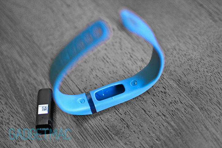
There is one design flaw with the Flex's interchangeable wristband design though. When showering or washing hands, water would often leak into the compartment where the Flex tracker sits and the water condensation is visible underneath the plastic. The legibility of the LED progress bar isn't affected by this nor will the water harm the tracker itself.

Jawbone's Up while witty in its syncing capabilities, isn't wireless like the Flex and that's a disadvantage. You wirelessly sync the Flex virtually instantly with Fitbit's iOS and Android app using Bluetooth 4.0. The connectivity is reliable, quick and best of all it updates your data in the background as long as the app is running in the background too.

Syncing has not changed since Fitbit rolled out the One and Zip trackers. There are two ways in which you can wirelessly sync your Flex with your Fitbit account. You can either wirelessly sync over Bluetooth with your smartphone, or use the included tiny wireless dongle to sync with Fitbit's OS X and Windows app when you're at home. Updating your Flex can only be done using the desktop Fitbit app however which can become inconvenient should you misplace that tiny dongle.

Battery life is very good, but not as great at the week-long battery life of the Up. Then again, recharging the Flex takes very little time that I don't think it's much of a nuisance. You'll get around 5 days of battery life as long as you don't set a daily silent alarm and keep tapping to check if you've reached your goal. The Flex comes with a short USB cable with a charging cradle at the end where you slide the Flex tracking in to begin charging. Sadly you don't get a wall charger.
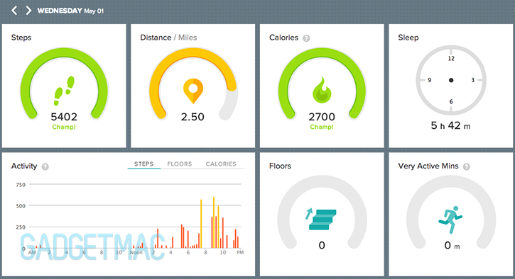
Fitbit improved its dashboard interface slightly with a more appealing display of your statistics which you can view online. You'll have access to all of the mobile app data points only that they are now displayed to you in a mixture of Nike and Jawbone-inspired interface.

Fitbit's iOS app is unfortunately still as stale and extremely ugly as it was before. It lacks the polish and eye-candy of the Up app which is filled with features, great looking data graphs and overall better user experience. While Fitbit's iOS app isn't as good or as bug-free as Jawbone's, it actually works well in displaying the things you should understand and want to know in a straightforward manner. The app lets you set silent alarms, set goals for each category and share your results with Twitter and friends with a Fitbit app. At this moment, there are bugs that cause some weird inaccurate tracking of data when syncing with the Flex, and hopefully these will be taken care of sooner rather than later.
The app also enables you to log and keep track of what you ate during the day and how much you've had to drink, but those all require manual input on your part and that's just something I don't want to be doing. It's too time consuming and impossible if you think about it unless it was your one and only priority. So if you weed all of the gimmicky features we're left with a device that counts steps, distance and tells you what it thinks you've burned - all while it wirelessly syncs said stats. If only it could tell time too then it wouldn't have seemed lackluster. But you can swap out wristbands which is neat so that kind of makes up for that.
![]()
The question is, which of these two respectable fitness tracking wristbands perform better? After testing the two simultaneously, the answer is none. Both the Flex and Up will do a near-indistinguishable job at tracking your steps very accurately as they should, but as for counting how many calories you've burned in the process we can't really say for sure. I'm no fitness health expert nor a dietitian, but I don't think the Flex displays an accurate representation of your burned calories and neither does Fitbit's One. Tracking your sleep is a useless gimmick we think and the same goes for every one of these multi-featured fitness tracking monitors including the Up.
There's a good reason why you shouldn't go with a fitness tracking wristband such as the Flex and the Up, and that's because anything that occupies your wristband-wearing hand such as pushing a cart, holding onto something and so on - will not count your steps unlike a clip-on device like the One and the Zip which will always track your activity no matter what you do with your hands. Each tracker has its drawbacks and positives, and you should pick whichever one you feel more comfortable with.
If you're contemplating between which of the two you should go for, know that the Flex is more comfortable to live and work out with, syncs wirelessly with your devices and is $30 cheaper. The Up on the other hand offers a unique stylish jewelry-like design with an amazing app to back it up, and that's about it. At this point, it all comes down to which one appeals to you most visually, because both offer near-identical hardware and performance, albeit we favor the Flex more despite its few drawbacks. And if tracking every move you make is important to you, then you should look at Fitbit's One tracker instead. We only wish Fitbit would have implemented more into the Flex in terms of how data is displayed to the user instead of pulling off an easy Jawbone on us. Nike's FuelBand remains to be the most useful out of the three, however, it's obnoxiously bulky and too expensive.
